

7 Performance-Centric Landing Page Design Services That Pull Leads
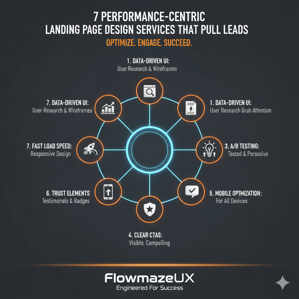
In the fast-paced world of online marketing, your first impression is sometimes your only chance to make a sale. If someone clicks on your link from a search result or a social media ad, they want to know right away what the problem is and how to fix it. People will go back to your competitors if your page takes too long to load or looks messy. "Performance Engineering" is the art of finding the right balance between appearance, speed, and psychological triggers. This is what Modern Landing Page Design Services do. No matter how big or small your business is, your website should be a salesperson that never sleeps or takes a break.
1. Making the eye path and visual hierarchy better
People may easily find the call to action (CTA) on the top pages. We arrange information by relevance using a process called "visual hierarchy."
- The F-Pattern: Most people read pages in an "F" shape. We put the most important value propositions where people are likely to look.
- High-authority designs often employ buttons in vibrant, contrasting hues, ensuring they grab attention against whatever backdrop they sit upon.
- By simplifying the learning process, you lessen the cognitive burden on individuals, which in turn makes them more likely to make a purchase.
2. Services for Creating Landing Pages That Load Quickly
Brand credibility is very important in 2026. People get annoyed right away when a page takes a long time to load, because it makes them think the designer doesn't care about the user experience.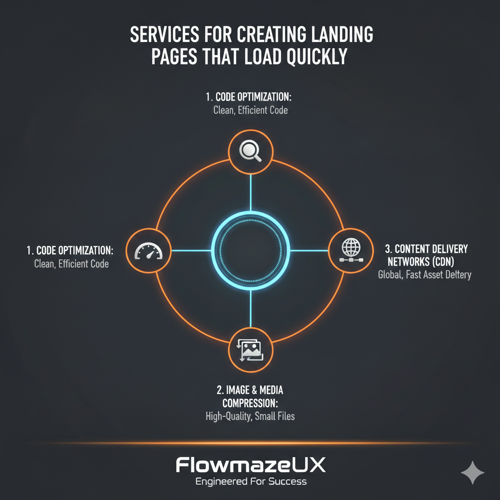
- The technical part: We look at Core Web Vitals, especially Largest Contentful Paint (LCP). This ensures that your hero image and main headline appear within 2.5 seconds.
- Asset Compression: We can maintain photo clarity while avoiding bloated file sizes. This is achievable with modern image formats such as WebP or AVIF.
- Browser caching, when properly configured, can enhance your business's credibility. It does this by delivering content more swiftly to returning visitors.
3. Architecture that works on tablets and phones
More than 60% of web traffic comes from mobile devices, so a "desktop-first" approach is sure to fail. The tiniest screen is where performance-centered design starts.
- The Thumb Zone: We make sure all interactive elements are close enough to a user's thumb that they can't accidentally click them or get mad.
- Adaptive Media: The pictures on your page should be sized to fit the user's device. This way, smartphone users won't have to download a hefty file to their computers.
- People stare at their phones as they tell stories. We put together different parts to build a story that keeps people intrigued as they scroll down the page.
4. Validation of Social Status in the Mind
People only buy from companies that other people trust. We placed social evidence directly into the design flow to help build this authority.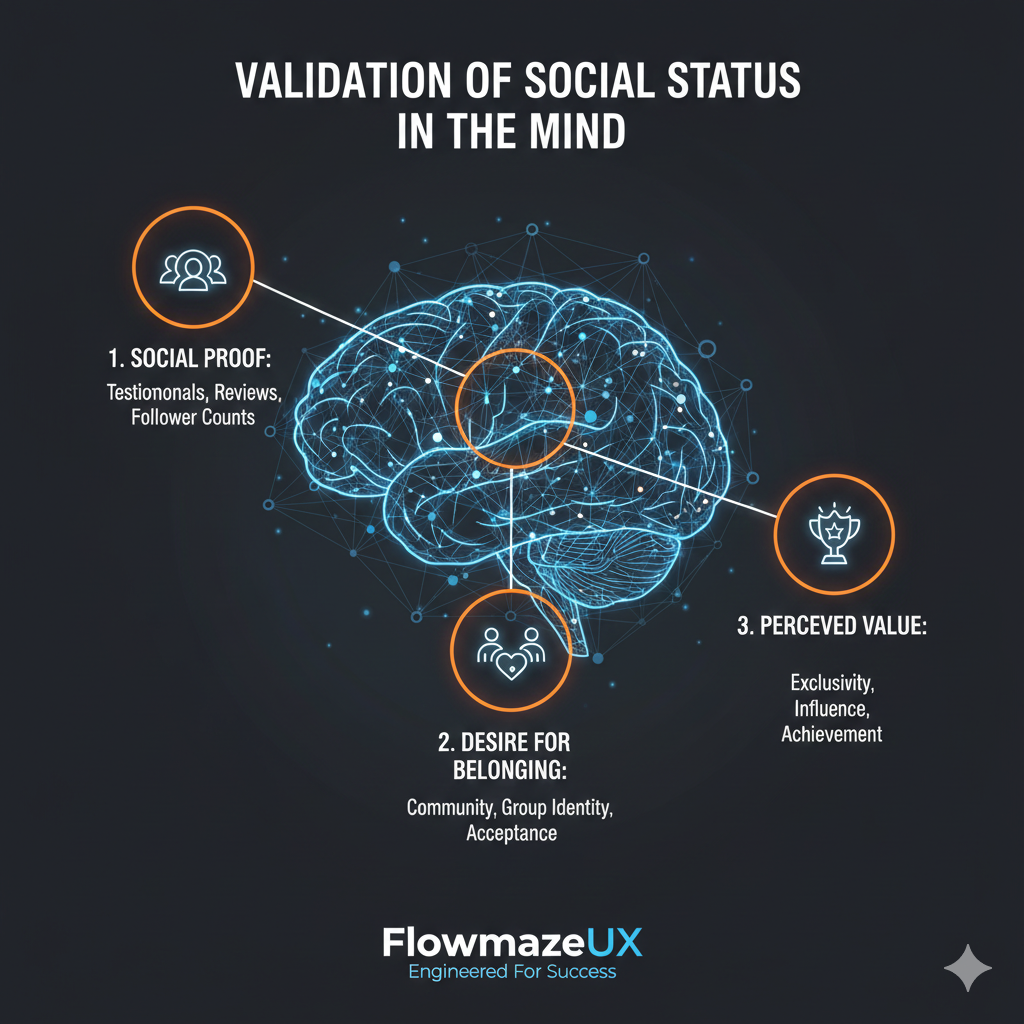
- Verified Reviews: Instead of having a separate "Testimonials" page, we put short, compelling quotes right next to the form to get leads.
- Logos of Authority: Adding "As Seen On" or "Trusted By" logos to your website makes your firm look more established.
- Real-Time Data: Showing live figures like "1,200 people signed up today" can trigger the "Fear of Missing Out" (FOMO).
5. Ways to get leads without any trouble
Having a long, hard-to-understand form is the quickest way to stop a conversion. The purpose of landing page design services that focus on performance is to make it feel like you're having a conversation when you provide information.
- Use terms that encourage people to take action, such as "Get My Free Audit" or "Start My Trial," rather than a generic "Submit" button.
- Progressive Disclosure: Start by asking for simple information. If you need more information, use a multi-step form to make things less scary.
- Field Validation: Users receive real-time feedback, such as a green checkmark, indicating they're filling out the form correctly. This helps avoid mistakes and drop-offs.
6. A/B Testing Rules for Strategy
It's not guesswork that makes designs work. We continually test new ideas to find the best mix of items that work for your audience.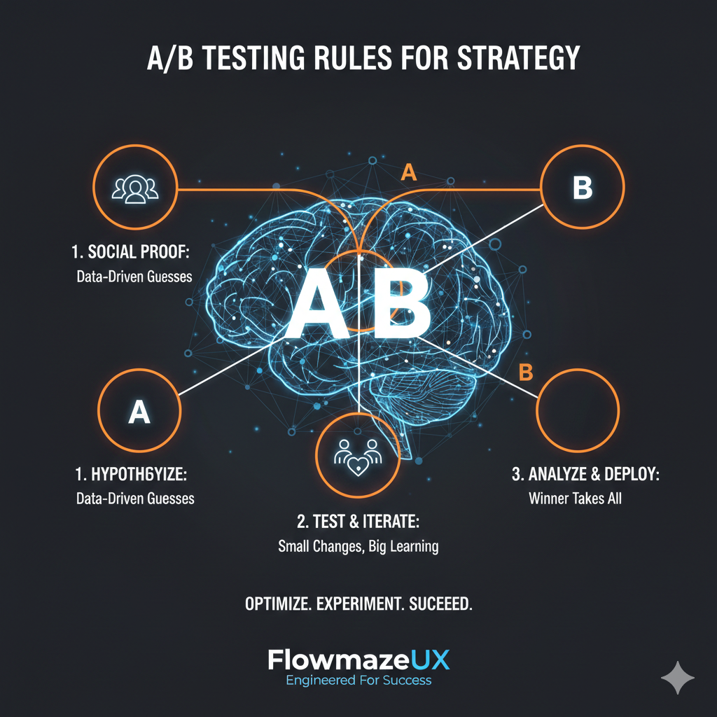
- Changing just one word in a headline can often make people click it 20% more often, or more.
- Heatmap Analysis: We use heatmaps to show where people click and where they get stuck. This approach allows us to prioritize the most pertinent details within the "hot zones."
- Incremental progress: Each month, you refine your approach using data, ensuring your return on investment continues to climb.
7. Improving Interaction to Next Paint (INP)
The speed at which a page reacts to a user's click is currently the most critical factor in user experience. This is known as "Interaction to Next Paint."
- Instant feedback is key. When a button gets clicked, something needs to happen right away. Think of a loading spinner or a quick color change.
- Main Thread Efficiency: By eliminating unnecessary JavaScript, we ensure the browser remains responsive, preventing it from becoming unresponsive during user interactions.
The overall experience exudes quality, a result of the fluid animations and the system's quick responsiveness.
Key Performance Indicators to Keep an Eye On
Here are the most important things your business has to pay attention to, instead of a complicated table: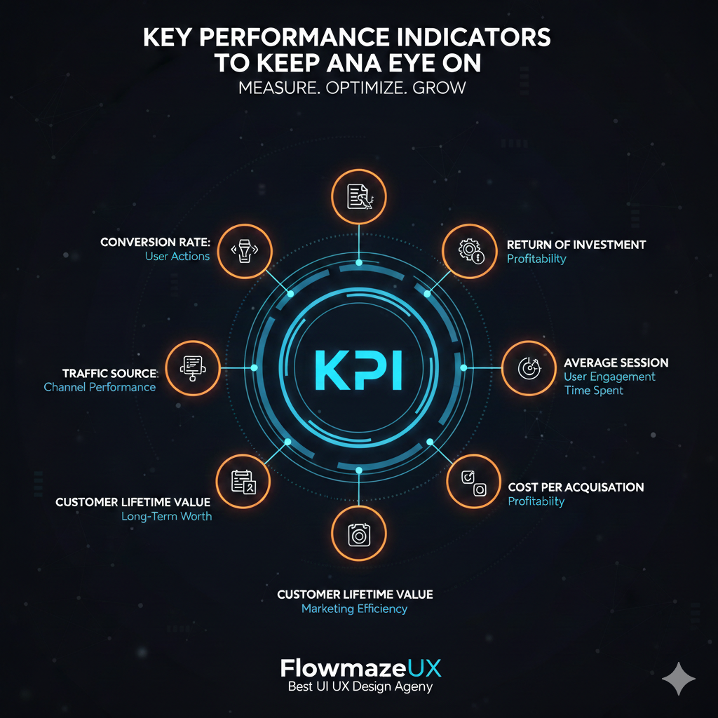
- Conversion Rate: Try to stay between 5% and 11%. If your percentage is less than 3%, people are having trouble understanding your message or design.
- Keep the bounce rate below 50%. If many people leave your page without clicking anything, it usually means it is too slow or doesn't match the ad that brought them there.
- Completion Rate: If people start filling out the form but don't finish, it could be because the form is too long or it asks for too much personal information too quickly.
- Average Time on Page: Users need to spend at least 45 to 60 seconds on the page to fully understand what you're giving.
Insights from the Front Lines
I've discovered that "simple" is always better than "fancy" when it comes to constructing high-stakes funnels. There was a time when a customer paid thousands of dollars for a website with many 3D animations and scrolling effects. It seemed like a beautiful piece of art, but only 1% of visitors stayed because it took 9 seconds to load on a phone.
We boosted the conversion rate to 8.5% in just 14 days by removing unnecessary weight, focusing on Largest Contentful Paint (LCP), and using a clear, benefit-driven title. If you want to see real results, you need to get rid of anything that is in the way of your customer and your solution. If you give visitors a quick, clear, and stable experience, they will trust you and spend their money with you.
How to Make Money with Design: Last Thoughts
Your landing page is the most important thing you have online. It shows off your brand to every possible customer, 24 hours a day, 7 days a week, in every time zone. You are establishing a scalable income generator by hiring Landing Page Design Services that focus on speed, performance, and psychology.
The study is very thorough: companies that adopt a structured approach to conversion improvement are twice as likely to see a significant increase in sales. In 2026, the firms that do well are the ones that are clear and rapid in what they say. You don't have to utilize a standard design. You can make a design that is meant to make money and convince people to change.
