

 Pro Benefits
 About
About
 Términos
 Privacidad
 Child Safety & Protection
 Notificaciones
 Ayrush Global It Services Pvt Ltd
The Responsive Images Handbook: Mastering srcset and sizes
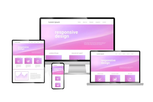
In today's multi-device world, a one-size-fits-all approach to images is a recipe for poor performance and a frustrating user experience. Serving a massive, high-resolution desktop image to a mobile user on a slow connection wastes bandwidth, slows down your site, and hurts your SEO. This is where mastering responsive images becomes non-negotiable, and the cornerstone of this technique is understanding the HTML srcset and sizes attributes.
For any business investing in Responsive Website Design Services, implementing proper responsive images isn't a luxury—it's a core requirement for success.
Why Just CSS Resizing Isn't Enough
You might think setting max-width: 100% on your images is enough. While this makes them look good by scaling to fit their container, it doesn't solve the core problem. You're still forcing every user to download the largest version of the image, regardless of their screen size. This leads to bloated page weights and sluggish loading times, especially on mobile networks.
Enter the <img> Tag's Superpowers: srcset and sizes
The srcset and sizes attributes work in tandem to instruct the browser on which image file to download, creating an efficient, tailored experience.
1. srcset: Providing the Menu of Options
Think of srcset as a menu you provide to the browser. It's a list of the image files you have available and their intrinsic widths (or densities).
<img srcset="image-small.jpg 500w,
             image-medium.jpg 1000w,
             image-large.jpg 2000w"
     sizes="(max-width: 768px) 100vw, 50vw"
     src="image-medium.jpg" alt="Descriptive alt text">
Here, we’re offering the browser three choices: a 500px-wide image, a 1000px-wide one, and a 2000px-wide one. The w descriptor tells the browser the actual width of each file.
2. sizes: Defining the Display Rules
The sizes attribute tells the browser how much space the image will take up on the page at different breakpoints. It's a set of media queries and layout instructions.
In our example, sizes="(max-width: 768px) 100vw, 50vw" means:
-
If the viewport is 768px or less: The image will be displayed at 100% of the viewport width (100vw).
-
Otherwise (on larger screens): The image will be displayed at 50% of the viewport width (50vw).
How the Browser Uses This Information
The browser is a smart shopper. It combines the information from srcset (the options) and sizes (the display size) with what it knows about the user's device (screen size, pixel density, and even network conditions). It then automatically selects the most appropriate image from the srcset to download.
The result? A mobile user on a small screen gets the small, fast-loading file. A user on a high-DPI (Retina) display gets a sharper, larger file. Everyone gets an optimized experience without any wasted data.
The Hallmark of Professional Responsive Website Design Services
Mastering srcset and sizes is a technical detail that separates a good website from a great one. It’s a critical skill for developers and a key offering of expert Responsive Website Design Services. By implementing this correctly, you future-proof your site, boost its performance metrics, improve SEO, and, most importantly, provide a seamless experience for every single visitor, no matter how they browse.

 Spanish
 English
 Arabic
 French
 Portuguese
 Deutsch
 Turkish
 Dutch
Dutch
 Italiano
 Russian
 Romaian
 Portuguese (Brazil)
 Greek
Greek
